

Who had the best and worst alternate uniforms released with the new Hometown Remix jerseys?
🚨 All 32 NHL Hometown Remix jerseys, front and back: pic.twitter.com/XLPBkFYdGx
— NHL News (@PuckReportNHL) November 2, 2026
32. Pittsburgh Penguins
The Penguins have completely reinvented their colors - and it isn't pleasant-looking. Frankly, it doesn't fit and is an eyesore. A team should try at least to stay somewhat close to their original colors, or at least make it work, not whatever this is.
31. Washington Capitals
What are we doing out here, Washington? The Capitals decided to ditch their colors, and we went with an ugly uniform with a logo that belongs in a cheap football game that I can download for free and that doesn't have real teams.
30. Anaheim Ducks
I found these other uniforms ugly and not matching any of their original colors. Honestly, this feels like a crayon box. Not good at all.
29. Colorado Avalanche
Perhaps the Colorado Avalanche can make it work, but are they trying to do a Penn State wideout? For a team with so much to work with, it feels like this lack of creativity, just being white was a big swing and a miss.
28. Chicago Blackhawks
I might give Chicago a bigger chance once I see them on the ice, but green doesn't fit a team with the Blackhawks' nice colors. Plus, nothing creative came out of this. It looks like they just made the jersey green...
27. Detroit Red Wings
No Creativity. At all. "Hockey town" is a nice touch, but no color change, no unique way of displaying anything, just a simple jersey. Not the monstrosity that some other teams released, but a lack of creativity makes this jersey pretty bad.
26. Calgary Flames
Oof. What is this color combination? Thinking of the Flames doesn't make me think of honey-mustard yellow. The Flames have a lot to work with, but they somehow came up with this.
25. Montreal Canadians
Montreal, the ice is white. Why release a jersey that makes it look like a college football team is trying to pull off a nice whiteout? Just another instance of a lack of creativity that puts the Canadiens' jerseys low on this ranking.
24. Ottawa Senators
Again, this jersey doesn't accomplish much for me. Why? It's too similiar to the original design, and despite the new color, again, not a lot of creativity makes it lack a good ranking here.
23. Vancouver Canucks
Really, I don't like alternate uniforms unless they are unique and change a lot. Just making a current uniform a different color just screams meh. Not bad and not at all and not unpleasant to the eyes, but once again, it is lacking.
21. Vegas Golden Knights
The only reason the Vegas Golden Knights' truly ugly jersey isn't lower on this list is that they play in Las Vegas, a unique city that begs for a unique jersey. Creativity and uniqueness are nice here, but that doesn't change the fact that the jersey is simply hard to look at.
20. Dallas Stars
I mean, it's not an eyesore. But it is a strange color combination and doesn't hit the right spot. Too much white, and the pattern of tires on the sleeves leaves a lot to be desired.
19. Nashville Predators
I don't mind the Preds' new uniform, but the colors don't seem to match the vibrancy of the team's usual colors. Not to mention, it's hard to see how some of these other jerseys rank this low.
18. St. Louis Blues
I imagine these jerseys will look more appealing once they hit the ice. However, despite including the iconic St. Louis arch, the jersey lacks creativity. Just making a jersey black or white and not including some sort of color combination is a swing and a miss.
17. Minnesota Wild
Not much to say here, other than to at least try something new. Not bad-looking, but still a lackluster jersey.
16. Toronto Maple Leafs
Toronto sits in the middle of the pack. Overall, well done: nice colors, an interesting logo, and a cool-looking list. It is just not enough to get past some others on this lists.
15. Winnipeg Jets
I mean, it's alright. The jersey color combination is pretty good, but nothing is too special about this jersey. We move on.
14. Boston Bruins
Honestly, not a good-looking jersey combination. But I like how unique it is. It has a nice retro touch despite not being the prettiest-looking thing.
13. New Jersey Devils
It feels like little has changed for the Devils with this new jersey. But it is a clean look anyway. There was probably a lot of things that this team could've done though to make this jersey reach the Top 10.
12. New York Rangers
Nothing too crazy about this new jersey for the New York Rangers. But the colors are nice; it's a cool addition with Lady Liberty, and it has a clean overall look. It doesn't jump off the page, but it is pleasant to look at.
11. Philadelphia Flyers
I mean, strange choice for sure on this one. But something feels nice about the gray color of this jersey. I wanted to rank it lower, but it is strikingly unique and, honestly, pretty nice-looking.
10. Los Angeles Kings
I like it. I don't usually like a team looking purple or pink, but it fits pretty well. This gets an A for being a unique and overall nice jersey.
9. Edmonton Oilers
Yes, I want creativity and some room to venture off for teams. The Oilers didn't exactly do that, but for some reason, orange and black equals a wonderful-looking jersey. I like it, not bad at all.
8. Carolina Hurricanes
Using its other logo and combining it with some interesting colors puts the Hurricanes high on the list. Sometimes, in all sports, teams don't do enough with their unique logos. I like the effort. Not great looking, but not bad either.
7. New York Islanders
The New York Islanders decided to use a fan-submitted logo, which I love. Nothing too special about it compared to some other nice designs, but I can't dislike it because of its unique features and the good colors.
6. Tampa Bay Lightning
The new logo, in addition to the lightning on the sleeves, makes me like this a lot. Tampa Bay decided to move far away from its original colors, and I like that. The skull is also just cool.
5. San Jose Sharks
San Jose went in an awesome direction and even put teeth on the sleeves. The Sharks have some cool colors, and seeing them put them to good use is a good thing. Just a clean look that jumps off the page.
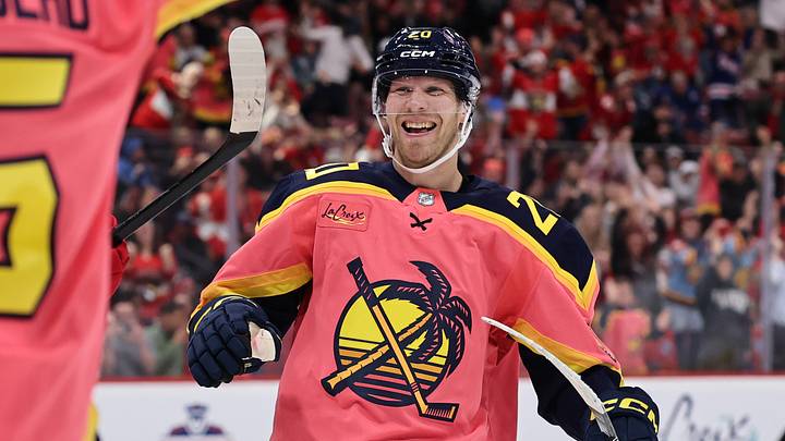
4. Florida Panthers
Kudos to the Panthers for being unique and jumping into the State of Florida. The jersey doesn't sem to represent a Panther at all, but honestly, it's nice looking and does what the name is supposed to do, represent the hometown of Miami.
3. Seattle Kraken
I don't like the standard Kraken logo. Honestly, they should switch to this one instead. The colors aren't bad; the logo is great, and the design is clean and not doing too much. This was very well done by Seattle.
2. Utah Mammoth
I was worried this would stink. The logo honestly doesn't make me ecstatic, but it is still pretty good nonetheless. The color combination is awesome. It's unique; no other team has used it, and it mixes super well with black to create a perfect design that makes me feel like it represents Utah very well.
1. Columbus Blue Jackets
Boom. Literally. The Blue Jackets used a great-looking cannon and gave us beautiful colors. I mean, in terms of logos, this alternate one clears the current one by a country mile. Maybe it's just me, but a Civil War cannon is a thing of beauty, and using it this well with nice colors is just a treat. I can't wait to see these take the ice.
Ultimately, this is a pretty fun thing to do and maybe teams will consider doing even more new jerseys in the future.
 Add us as a preferred source on Google